distinctiveness and the risk of not taking risks

when you enter the supermarket aisle in search of a bottle of water, what do you see? from my point of view, it’s proof that few companies understand the meaning of distinctiveness. after all, the most common thing is to see a series of very similar bottles, usually in shades of blue, white, or green (for the more daring), always with the same visual codes, such as mountains, streams, springs, nature, among other clichés.
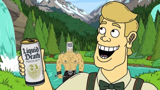
until Liquid Death arrives, a bottled water brand that is the definition of “distinction” and is shaking up the industry. while other brands follow the same old routine with plastic packaging and advertisements about springs and refreshing hydration, Liquid Death decided to differentiate themselves for real and leave everyone in awe. take a look:
- BREAKING THE BANK
nothing boring about following market rules. while the competition is betting on clichés, Liquid Death decided to talk about demons, death, and quenching thirst. it’s a completely different approach and, wow, it worked! they won the attention and heart of many rebellious consumers who were tired of the same old thing. - UNIQUE STYLE AND MARKED PERSONALITY
not satisfied with changing the message, Liquid Death also revolutionized the look of the bottles. no boring, transparent bottles for them. they opted for badass aluminum cans that look like canned beers, with melting skulls on the label. - CREATIVITY IN THE VEIN
Liquid Death doesn’t care about pleasing everyone! their strategy is to create fun content that entertains the audience. they dove headfirst into marketing and partnered with unlikely celebrities, like Martha Stewart and Cherie DeVille, an adult film star. they also released an album with songs made from negative comments they received online. - SAVING THE PLANET
in addition to all the rebellion, Liquid Death is also concerned about the environment. they use recyclable aluminum cans instead of plastic bottles and raise the flag of sustainability. the brand knows that plastic production is destroying the planet, so they decided to make a difference and raise awareness. to quote them: “death to plastic!”

all of this is working very well for the company, which made USD 100 million in 2022 and already has a valuation of USD 700 million.
SOME MORE SUBTLE EXAMPLES OF DISTINCTIVENESS
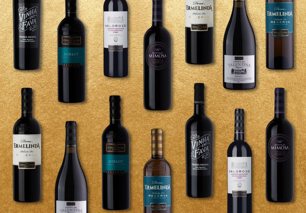
here in Portugal, there is a winery called Casa Ermelinda Freitas that produces some of my favorite wines. they adopted a subtle yet extremely effective strategy that makes all the difference at the point of sale: the plastic that surrounds the cork has stripes. yes, it’s “just” that, a plastic with stripes! however, since they are the only ones with this characteristic, their wines stand out completely among the infinity of bottles and similar labels on the shelves of Portuguese markets. it’s design as a solution!
and there are several ways to stand out, just choose NOT to do what others are doing. or do what others don’t have the courage to do – yes, it’s as simple as that. looking again at visual codes, we can mention NUbank, which chose a bold color that completely deviated from the category standard (besides the fact that the name itself is a gem, right). or Obvious‘s Instagram profile, which is always a few years ahead in graphic design trends, which causes a certain strangeness for those who are always seeing the same old homogenous visual stimulus, but feel attracted by curiosity – so much so that it was the profile with the highest engagement in Brazil in 2022. and a very cool thing about Obvious is that, unlike many brands, they do not have a logo, fixed color palette, typography, or anything from a standard visual identity kit, but they create such different and iconic visual styles that it is still easy to differentiate them in the feed. and even to these styles they don’t have much attachment, since as soon as the trend catches on, they change again, always maintaining a distinct identity. I propose a challenge to you: want to know what the next Instagram design trend will be? just observe what they’re doing now.

BACK TO BORING WATER BOTTLES
you know what’s worse? I’m sure many of the briefings for creating these packaging said things like “we want something that stands out at the point of sale” or “we want something different and creative,” or any variation of this empty speech. I bet all my money (ok, not a fortune…) that if an agency or designer presented an option that resembled an IPA beer made for metalheads, the work would be discarded and the creative would be called crazy.
the risk of not taking risks is this: drowning in the sea of indifference!
being just another one. this can have a very high cost on the results of companies.
read more:
when medium is the message: a meta-analysis of the effects of advertising in creative media