INCLUSION COUNCIL: VISUAL IDENTITY
CHALLENGE
Heineken Portugal invited us to take on one of those heartwarming (and portfolio-worthy) missions: to create the visual identity for their brand-new Inclusion Council, an internal task force focused on Diversity, Equity and Inclusion (aka DEI for the close ones).
the challenge? stick to Heineken’s global DEI look and feel, but give it a fresh, local twist. something with real personality. something that screams: “made by people who actually care about this topic.”
spoiler alert: we do care. and we delivered.
INSIGHT
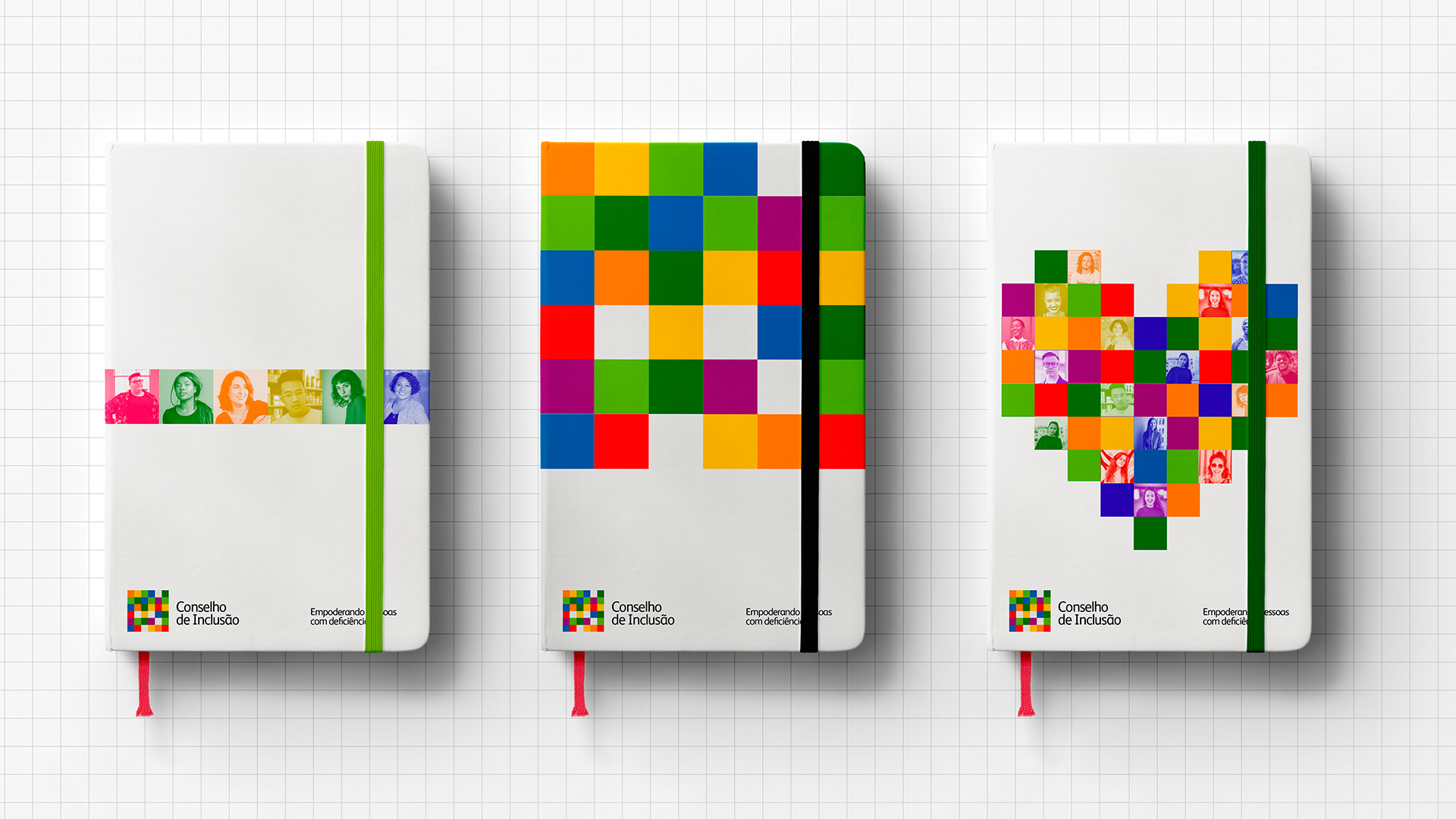
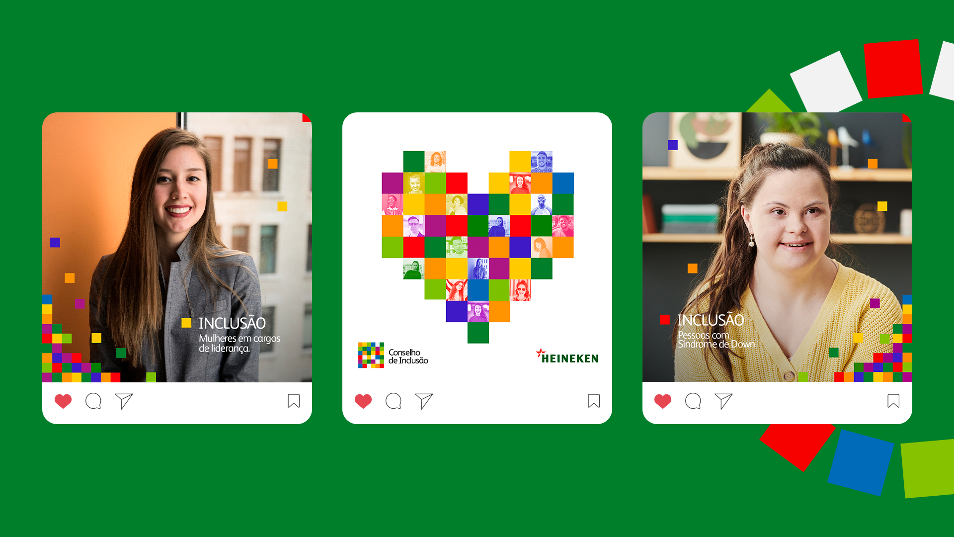
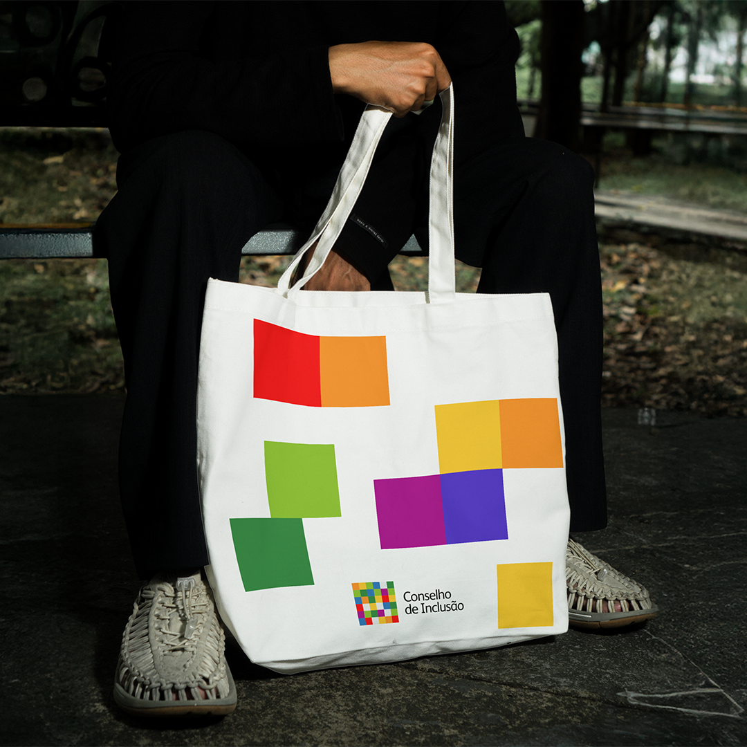
as we studied the global DEI identity, one tiny detail jumped out at us: the little square shapes, kind of like pixels.
that’s when it clicked: if every pixel is a different color, a different shape, a different person… then together, they tell a story. and not just any story, our story. one of inclusion, listening, and collective growth.
so we thought: what if the entire identity was built on this concept?
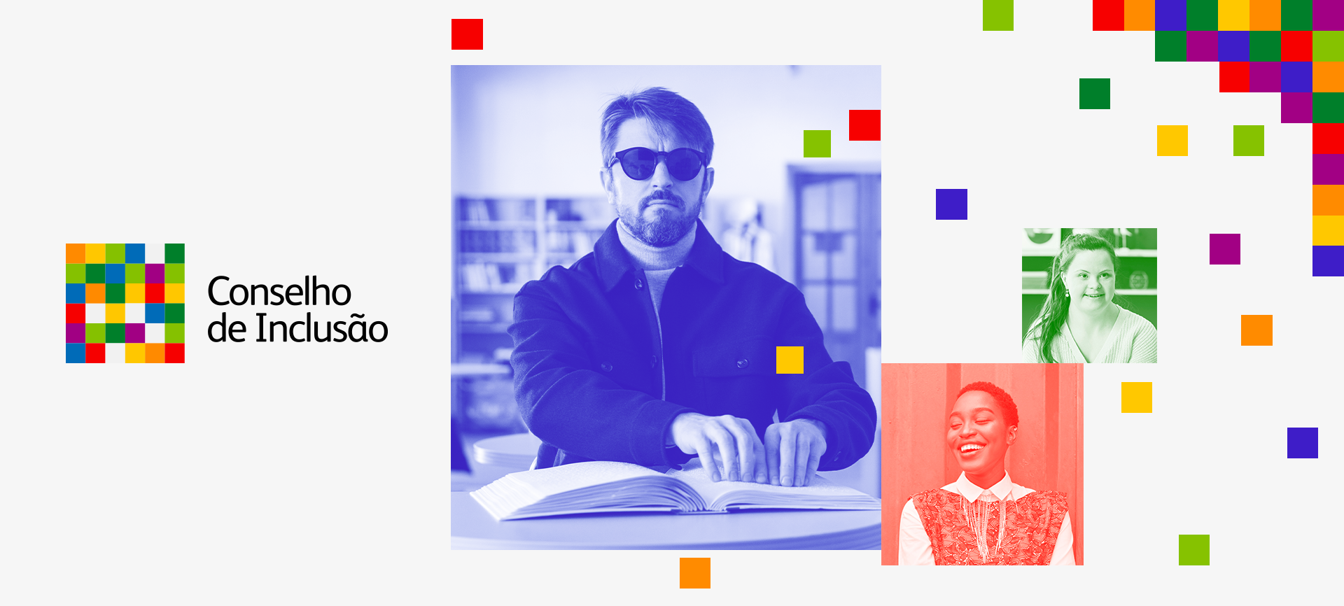
SOLUTION
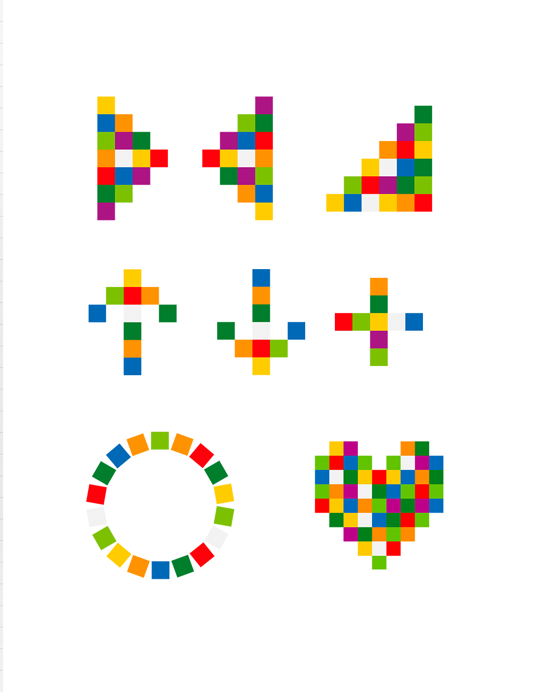
from the pixels, we created a living visual system. one that transforms, adapts, and represents the collective.
it can become a staircase (to show growth), a wheel (to show diversity in motion), or a heart (because without care, inclusion means nothing).
all crafted with love, purpose, and a bold splash of color.

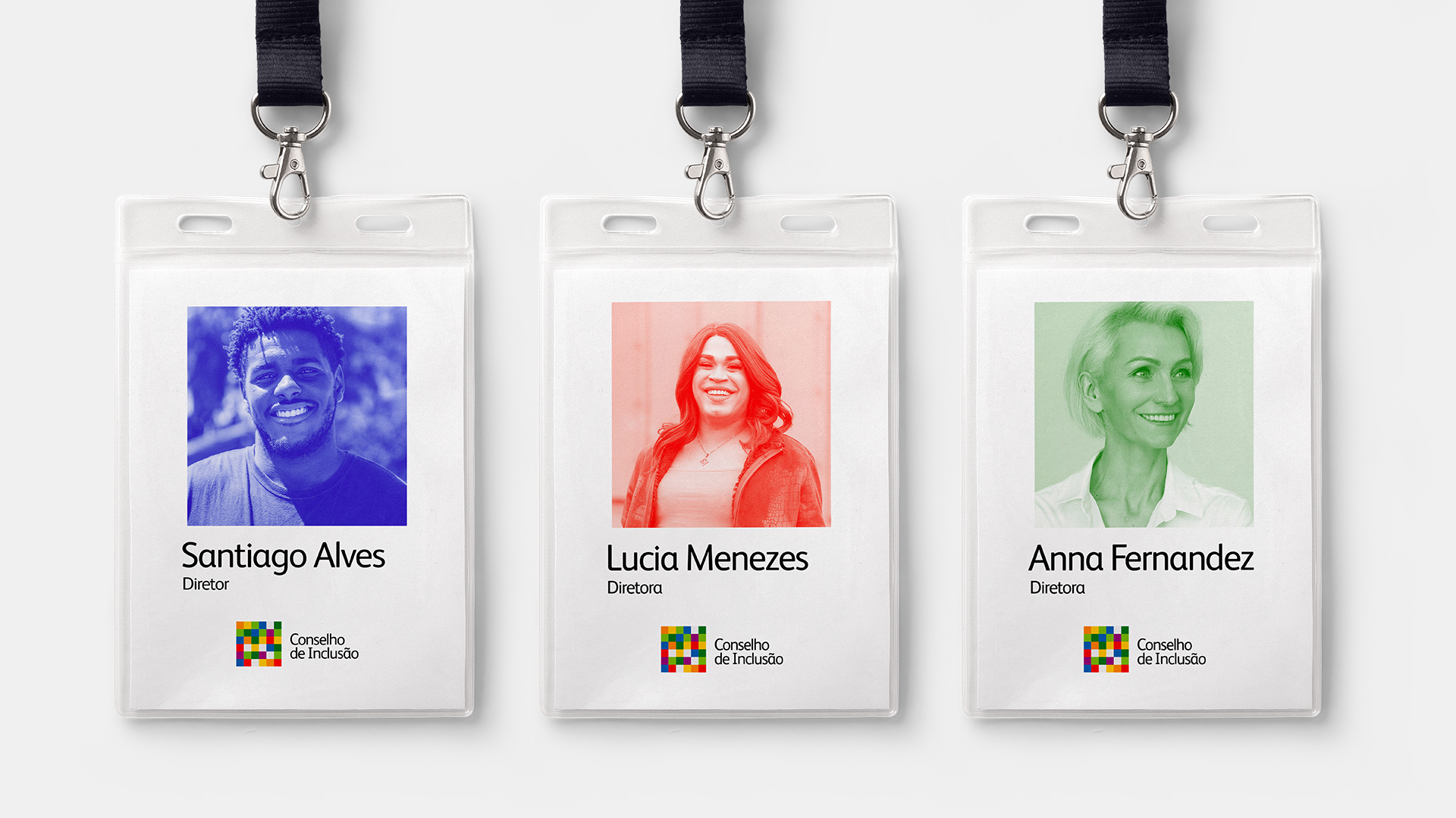
BEHIND THE DESIGN
more than looking good, we wanted this to feel right. because inclusion isn’t a trendy deck, it’s a daily commitment. so every color, every pixel, every face had a reason to be there.
RESULT
the Heineken team loved it (and we might’ve grinned a little too hard during that call).
the project became a powerful internal engagement tool, gave visibility to the Inclusion Council, and most importantly, helped reinforce a culture built on respect, empathy and real action.
and us? we’re just proud to have been part of it.
CREDITS
CREATIVE DIRECTION
João Jesus
Henrique de Moraes
ART DIRECTION
Alice Tessler
ACCOUNT MANAGER
Tarsila Lima